Sunday 8 March 2015

Week 10 : Dave McKean


Week 10 : Dave McKean


Dave McKean is an illustrator, comic book artist, photographer and graphic designer that specializes in creating strange and surreal pictures usually made up from photomontage collages. He's worked on many different projects, mainly with the famous author, Neil Gaiman. He created covers and various illustrations for Gaiman's 'Sandman' series as well as cover artwork for the book 'Coraline'.


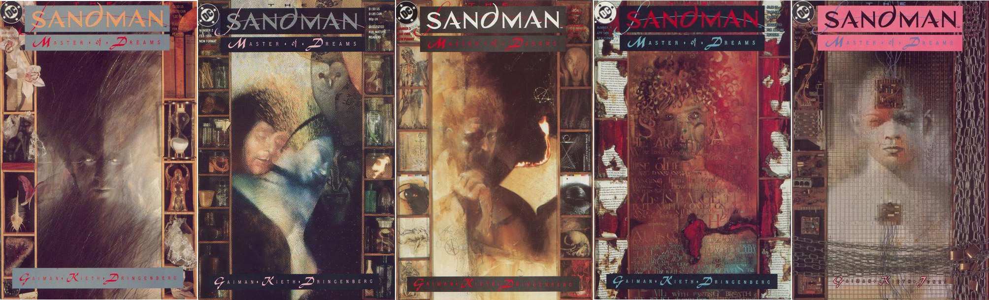
Covers created by Dave McKean for Neil Gaiman's 'Sandman' series


He also worked for DC comics, creating cover art for the 'Hellblazer' series and eventually, the graphic novel version of 'Arkham Asylum'.


Excerpt from the 'Arkham Asylum' graphic novel.

He also directed his own movie in 2005 named 'Mirrormask'. His the photomontage and paint effects, as well as the colour schemes of his artwork were transitioned into the movie through the set designs, costumes and creature designs.


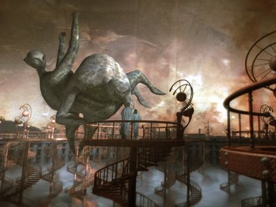
A screen shot from the movie, 'Mirrormask'. The whole composition of the scene looks exactly like a painting by Dave McKean.

Week 9 : Gendering the image


Week 9 : Gendering the image


Trying to decipher the gender of an artist simply by looking at the artwork they've created is a difficult task. Gender norms can usually be ruled out when it comes to the overall style of an artists portfolio and if their gender affects their artwork.

Anything that's overly feminine in any kind of artwork is usually automatically assumed to have been created by a woman and vice versa regarding men. Although, this isn't true in the majority of the time.

A good example of this would be the works of Mark Ryden, a male 'low brow' 'hi-fructose' artist whose artwork can be seen as quite childlike and feminine at first. His paintings often have dark, strange themes hidden under the guise of sweet, childlike innocence.

Mark Ryden's Katy Perry painting.

Week 8 : Self Identity


Week 8 : Self Identity


As an artist, you will eventually need to analyse your own work in order to understand your own artwork and who it could appeal to. This calls for critical assessments and the ability to recognize your own strengths and weaknesses.

In order to do this, I'm going to quickly analyse my own artwork and discuss the artists that influence and inspire me.


For a very long time, I was solely drawing and colouring my artwork traditionally. My traditional main media of choice was, and still is, coloured pencils and occasionally fine liner pen.

Quick study drawings of bearded dragons and frogs from last year during my animals and creatures project, drawn in coloured pencil and fine liner pen.

I'm very interested in fashion illustration and one of the first artists I ever considered to be a major influence on me was the French fashion illustrator, Marguerite Sauvage.

Marguerite is an illustrator who works in many different fields and has a very feminine and flowing look to her artwork. Her choice in colour palettes and her linework are very inspiring to me and I try to emulate her effortless drawing style in my artwork in my own individual way.

My traditional pencil skills are something that I have developed and honed on my own accord and I'm actually very proud with how far I've come in terms of skill and choosing which color palettes work best. I consider this to be one of my strengths.

Another artist that I look up to is the Japanese artist, Hikari Shimoda. Her paintings are a mixture of modern day Japanese 'kawaii' culture and hidden creepy undertones, a strange theme that I also love and try to emulate in my artwork.

Hikari often uses soft, pastel colours in her artwork and sometimes incorporates things like stickers and adhesive glitter to her paintings.

This is a digital piece I created for my 'Fashion Monsters' project last year. I've only recently started using digital media to create and draw with so I'm not fully experienced with the art of digitally drawing yet. My linework also translates differently to my digital artwork than my traditional artwork so my lack of understanding in some fields of drawing would be a weakness of mine.


Week 7 : The image as space


Week 7 : The image as space


Books aimed at children have always been a huge factor in the field of illustration. One the biggest and most successful book companies of all time were Ladybird books, which ran from the 1950's to the 1970's.

Each ladybird book was a small hardback with full colour drawings. Artists who usually worked as comic book artists or manufacturing designers were hired to create colour illustrations for the Ladybird books. Some books were made to be educational and acted like informative guides that were easy for children to understand. This series was named 'How it works'.


One of the books from the 'How it works' series, this book shows children how a car works complete with full colour illustrations.

Ladybird also printed and produced a series of  children's short story books, featuring classic stories such Cinderella, Snow White and The Three Little Pigs. This series was referred to as the 'Well loved tales' series.


Two examples from the 'Well loved tales' Ladybird series are The Three Little Pigs and The Wolf and the Seven Kids.

Week 6 : The image as a message


Week 6 : The image as a message


Symbolism and hidden meaning have become a common occurrence in many different forms of art and can date back to many different periods in time. Deeper meanings in drawings and paintings, whether it is the subject of the picture maybe a hidden message can give a picture a whole new hidden, interesting layer that can be picked apart for study or discussion.

The growing popularity of narrative illustration during the end of the nineteenth century is also partly responsible creating the possibility of numerous meanings and messages in an illustration. 

An artist that utilized this was the contemporary artist, Aubrey Beardsley, who often hid erotic and humorous themes in his illustrations.

This illustration by Aubrey Beardsley shows two grotesques carrying Salome's corpse. Salome herself is a visual representation of the beauty in death. The coffin bears the words 'Fin', as in the imminent end.

His contribution to the periodical journal, 'The Yellow Book', was mainly through illustration work and the pictures that featured in the journals often had hid hidden images within the image itself.

Week four : Illustration as an object


Week four : Illustration as an object


In modern day life, illustration has become something that can be applied to other things than a drawing or painting. It can be applied to many things, namely product, clothing or graphic design.


Designing products such as toys that still have a stylised, illustrative look and feel to them can also be seen as a form of art to some people. A good example of this would be the line of 'wearable' toys named 'Playsacks', created by graphic artist, Fredun Shapur.


A magazine advertisement for 'Playsacks'.


A closer look at the designs of the 'Playsacks'. The designs depicted various brightly coloured animals drawn and made up of bold, geometric shapes and lines.

Fredun also created a series of flat jigsaw puzzles.

These wooden 'jigsaw puzzles' were made up of identical flat wooden rectangles with pictures of animals printed on one of their sides. This toy shows that illustration and creative graphic design can mesh very well together to create unique products.

Week three : The image as cultural change


Week three : The image as cultural change


Album covers have also been seen as art by many. especially when artists are hired by recording companies to create iconic album covers targeted at specific audiences (usually teenagers or young adults). This can be said for many things such as books covers or product packaging, since some people admit to buying a product, book or album solely because they liked the cover design.

An album cover that was seen by many as one of the most artistically influential of all time was the cover of The Beatles's 1967 album, Sargent Pepper's Lonely Hearts Club Band. 


The cover for 'Sargent Pepper's Lonely Hearts Club Band', designed by photographer Peter Blake featuring the band themselves.


Peter Blake, a photographer and the designer behind the Sargent Pepper's album cover, decided that the theme for the image would be 'people we like'. Blake said that if they were in a park playing a concert then the people in the photo would just be anyone who turned up to the concert, but if they used cardboard cutouts, those people could be whoever they wanted. Along side celebrities and well known people, the Beatles also featured waxworks of themselves all dressed in matching suits; they referred to these as "the old Beatles". 

This colourful image would then go on to change the way album covers would look and be perceived, pushing the boundaries of the artistic creativity and ideas used to make and design an album cover.

Week Two : Chris Riddell and Heath Robinson


Week two : Chris Riddell and Heath Robinson


Inspiration and influence are both things that crop up frequently throughout the field of illustration. Most artists have something or some one that inspires them and that inspiration or influence will sometimes show in an artist's work.

Even certain artistic styles can influence someone. A good example of this the work of Heath Robinson, an English illustrator whose drawings of airships and intricate machinery are said to have been a large visual and aesthetic influence to the 'steampunk' style trend, which developed in the late 1980's.

Heath Robinson (full name William Heath Robinson) is well-known for his illustrations of machinery and complicated inventions.

An illustration by Heath Robinson depicting an overly complicated contraption created to split atoms


Robinson started his artistic career towards the end of 1890 as a book illustrator. He also wrote and illustrated his own children's books and, during the First World War, drew illustrations for newspapers that depicted unlikely secret weapons being used by German soldiers.


A WWI cartoon by Heath Robinson, depicting soldiers using various absurd methods to accomplish common everyday tasks such as making toast using candles.

Running themes throughout his illustrations were the machines he drew were often powered by steam boilers or some kind of pulley system. His illustrations were detailed and almost always drawn solely in black and white without colour.

An artist that was definitely influenced by Heath Robinson's drawings would be Chris Riddell, whose artistic career is quite similar to Robinson's.

Chris Riddell is an English, originally South African born, cartoonist and illustrator who began studying illustration in 1981 where he was taught by Raymond Briggs, an illustrator who Chris Riddell acknowledged as a big influence to his work.

Working as an illustrator, newspaper cartoonist and author, Riddell's career and overall art style is very similar to Heath Robinson's. Like Robinson, Chris Riddell specializes in creating black and white drawings with cross-hatched shading.


A sort of self portrait line drawing by Chris Riddell. His attention to detail in things like furniture and linework is very reminiscent of Heath Robinson's work.


Bibliography -

http://www.wired.co.uk/news/archive/2013-07/29/heath-robinson-deserves-a-museum

http://chrisriddellblog.tumblr.com/

http://www.chrisriddell.co.uk/

http://www.bbc.co.uk/history/historic_figures/robinson_william_heath.shtml


Week one: Blade Runner


Week one : 'Blade Runner'


Movies that are deemed to be influential in the modern day are sometimes one's that have a distinct 'style', whether it's the way it was shot and edited or it's overall look or costume/set design. However, influence from various sources can also be found in films that have also been considered by modern day standards to be influential.

'Blade Runner', a 1982 science fiction film directed by Ridley Scott, is a good example of this. The movie was originally adapted from the Phillip K. Dick novel, 'Do androids dream of electric sheep?' and is actually regarded by many as the greatest sci-fi movie ever made.


The movie actually shows many visual influences, mainly Japanese artisan/design style and 1970's punk fashion, in itself from the costume design to the set design.